

Push the Blacks!
Recently I have become aware of a tendency to push the values beyond the realistic in my figurative work, creating a dramatic sense of depth and mood. "Push the blacks, Sarah, push the contrast!" runs through my head constantly as I work, and I am noticing a distinct improvement in the quality and impact of the work. For example, this is a piece done for 'Daydreams' back in 2014 (left) compared with a similar one from early 2017 (right):
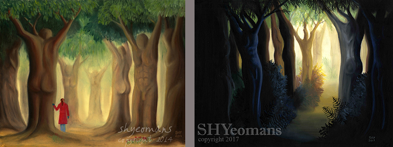
There are of course differences in technique; in 2014 oil pastel was a relatively new medium for me and my handling of it has improved in the last three years, but the thing that really surprised me was just how much more confident I had become with pushing the lights and darks:
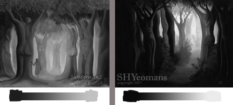
Here are the gradient values shown beside each other, 2014 painting top, 2017 painting bottom:

The other thing that makes the difference, of course, is that in the later painting the dark values comprise most of the image. In the 2014 painting, the different values are spread evenly throughout the whole scene, but in the 2017 painting the light values are concentrated in one area, leading the eye in.
Pushing the blacks can take a bit of courage. When I was about an hour into the 2017 painting, I had thick black oil pastel down over two thirds of the pastelmat, and bright cream in the middle, with some trees sketched out in brown and cobalt blue. I remember looking at it in horror thinking, "What have I done? How on Earth am I going to make this mess into a cohesive, attractive piece of art?" It nearly got binned; the sheer amount of black I'd used had me thinking it was ruined. I persevered anyway with a persistent feeling of hopelessness - and I'm grateful that I did as this piece became one of my favourite oil pastel pieces.
Chiaroscuro is a term used to describe the dramatic effect of contrasting areas of light and dark. It comes from a combination of the Italian for "light-dark." Originally it described a drawing on mid tone paper, with white paint or chalk added for highlights. In painting, chiaroscuro often describes the use of dramatic tonal values to model form. Caravaggio is probably the best known painter for chiaroscuro, and he often used a single directional light source to lift certain features and shapes while others receeded back into shadow.
Sciography is more of a scientific term than an art term, and used mostly in architecture, but I believe sciography is just as valid in fine art. Sciography, from the Greek for "Shadow-Write", is a science based on perspective when it comes to the projection of shadows. Because of the strong directional light source employed in chiaroscuro, equally strong shadows are very important.
It's perhaps not for everyone, but I find powerful contrasts and strong shadows exciting in figurative work. I love the drama and depth in chiaroscuro works.