

How to Choose Your Palette
YOU DON'T NEED ALL OF THE COLOURS...
General advice for painters is to get a basic split-primary colour palette together, and it will look something like this:
- white
- warm red such as cadmium red or burnt sienna
- cool red such as alizarin crimson or magenta
- warm yellow such as cadmium yellow or yellow ochre
- cool yellow such as cadmium lemon
- warm blue such as ultramine
- a cool blue such as pthalo blue green shade
- with the occasional addition of black or umber.
BUT
There are two important considerations often left unconsidered. The first is the artist's style or "voice", and the second is the subject.
The Voice
Colour choices, the pigments the artist chooses to create their work, are an important part of their "voice" and when these pigments have been chosen carefully, it really shows. The colours the artist has chosen, colours that align with their personal taste and the message they want to convey with their work, will have a dramatic impact on that artist's work and add something completely unique. Added to this, colour is such an amazing way of imparting emotion and the mood of probably almost any painting can be altered by changing its pigments.
It is generally considered in painting that value, the lights and darks of a composition, is more important than faithful colour reproduction. A painting with a strong value structure will read correctly regardless of what colour is chosen. Make your horses pink, and as long as the shadows and highlights are correct, the painting will look fine. Paint some brown horses and get the values wrong, it won't look good. So, basically, you can paint well with whatever colours you like.
A limited palette can easily be made with an artist's favourite pigments, giving their work a cohesive colour-scheme throughout and cementing colour as part of their style. Exclusively using a limited palette of colours selected for more personal reasons than simply being able to 'paint all of the things' makes such a difference to an artist's portfolio.
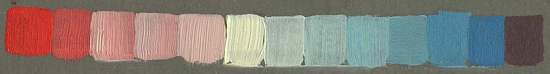
For example, if the artist loves pale, muted neutrals, a soft high-key palette could be made from a pale pink, a light naples yellow, ivory or cream, and a soft blue:
Above: Winsor & Newton's rosh blush - Naples yellow light - indigo
You could punch the saturation up a bit by using cadmium red and Prussian blue:
Above: cadmium red - ivory (nickel titanate yellow + plus white) - Prussian blue.
A changing the ivory for yellow ochre results in a more earthy palette with a good range of greens:
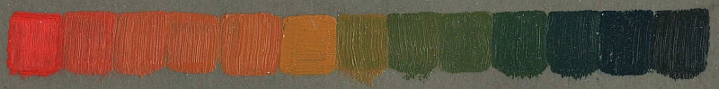
Above: cadmium red - yellow ochre - Prussian blue.
A moody, tinted charcoal style palette could be formed by choosing Payne's grey as the blue, raw sienna as the yellow, and Mars violet as the red, with white to modify value:
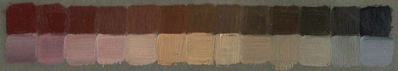
Above: Jackson's Mars violet - raw sienna - Payne's grey. Bottom string is a mix with white. At first glance this looks like a string of browns but, when you stop and pay attention, you can see that the full range of colour from red to blue is actually there. I love that subtlety.
I have seen portraits with a fantastic range of colour created with only white, burnt sienna, and viridian green, and landscapes painted with white, burnt sienna, and ultramarine blue.
The Subject
The subjects artists like to paint are also important for choosing colours. For example, a wildlife artist is going to be spending an inordinate amount of time mixing browns from the split-primary list above. Let me give you some examples of other options to the split-primary palette which are based on what the artist actually wants to do:
For painting nudes and portraits, the Zorn palette (black, white, red, earth yellow) is absolutely perfect. Any flesh tone can be mixed with these four colours. Adding a blue will increase the range you have for painting backgrounds and clothes.
If you paint animals the Zorn palette of black, white, red, and earth yellow would work ever so well, and an added blue would probably be useful for skies and mixing greens for backgrounds. However, you're going to use a lot of browns, so it's worth getting yourself burnt umber, raw umber, and burnt sienna too - there's no point mixing earth colours from red, yellow, and black/blue if you use them a lot! Although you can mix your browns (and therefore some people would say you should mix them) they tend to be the cheapest paints in any brand, and mixing an earth brown from cadmium yellow, cadmium red, and black would be a very expensive way of doing it. The primaries would then be used to adjust the browns, rather than mix them from scratch.
If you wanted to paint florals, you could use white, cyan, bright primary yellow, and magenta. This primary palette will make a broad, fairly equal spectrum of saturated colours. Adding a couple of tubes of green in addition to the primaries would just make your painting life easier. Again, you can use your primaries to adjust the greens rather than mixing them from scratch.
White, cyan, bright primary yellow, and magenta is also a very good still life palette, particularly where one is painting man-made objects.
If you mostly paint seascapes and skies a lot of white is very helpful, black is often helpful, and then I would choose two or three different blues (for example, pthalo blue green shade and ultramarine, and maybe a cobalt or cerulean), a soft, pale yellow, and a bright red. A viridian green (genuine, not a 'hue') would also help to make saturated turquoise shades and beautifully soft neutrals.
For landscapes a palette of white, cadmium red, cadmium yellow, and ultramarine blue would do most of your desired colours, but the addition of umber, indigo, viridian green, and sap green would likely help enormously.
In Practice
This is how who I am has changed my use of colour, and therefore effectively rendered the split-primary palette useless to me:
I don't like warm blues and grass-green. (I couldn't understand why I never seemed to think the countryside was as attractive as most people seemed to find it and it was only a few months ago, aged 39, that I realised it's the overwhelming sky blue/grass green combination!) I don't particularly like saturated yellows, oranges, purples, or yellow-greens and, unless I have something specific to say that requires that kind of colour, I don't often use them.
I do really like greys, creams, and neutrals, bright punchy red, teals, and duckegg blues and greens. I paint a LOT of flesh, so my everyday palette is pretty much based around the Zorn palette (cadmium red, yellow ochre, ivory black, and white), with two additions. I absolutely love nickel yellow, so that's on my palette. It's such a beautifully soft yellow and it's weak and pale in mixes, which I like. It's a proper pale, cold winter sun yellow. Prussian blue is my favourite blue, so that's the blue I use. I just love the bronze patina it gets when it dries as a mass-tone, and I love the clear blues it creates when mixed with white. When mixed with nickel yellow Prussian blue makes the most gorgeous deep, rich teals and soft duck-egg greens and blues. Also it smells amazing, and the smell of Prussian blue always seems a lot stronger than my other paints. It's slippery and greasy and gets absolutely everwhere, and I love painting with it.
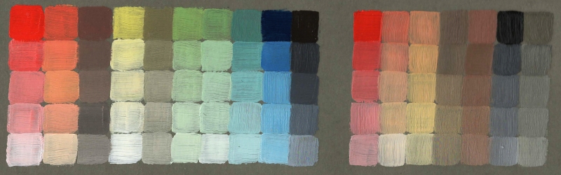
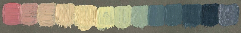
Left block: the colours I can make with cadmium red, nickel titanate yellow, Prussian blue, titanium white, and ivory black.
Right block, a variant on the Zorn palette using nickel titanate yellow instead of yellow ochre, for flesh hues.
They're all colours that I find absolutely gorgeous and love using.
I also have specific palettes for different projects. I have recently begun a series of paintings to celebrate my beautiful tiny friend, Honor, and for this I am using a palette comprising Winsor & Newton's pale rose blush, Naples yellow light, and indigo because this palette perfectly replicates her colours and gentle personality.
I use the Zorn palette exclusively for paintings in the series Oh Oh Oh! because it contains all the colours needed for painting a beagle against neutral grey backgrounds.
For the series Tourists my palette is just two colours; Prussian blue and nickel titanate yellow, and sometimes I'll use a bit of white, too.