

The Zorn Palette in Oil Pastels
The Zorn palette consists of black, red, yellow ochre, and white and was pioneered by the artist Anders Zorn for figure and portrait painting. The idea is that, next to red and yellow, the greys mixed by the black and white look blue enough to be convincing. To make this palette work, cold, blue-leaning black and red are needed. An orangey red will really severely limit the gamut of colours which can be mixed, and a warm earthy black will, when mixed with the yellow ochre, make brown instead of green.
Sennelier oil pastels perform beautifully in limited palette work because they are just so soft and blendable. While the brand of sticks can easily be interchangeable, always choose the Sennelier yellow ochre. It's the lowest tint strength and also the greasiest. These two qualities combined make it an excellent "lubricant" for the three other sticks. Harder oil pastels can resist blending, making it much more difficult to mix new hues in limited palette work, but they'll mix into the Sennelier yellow ochre.
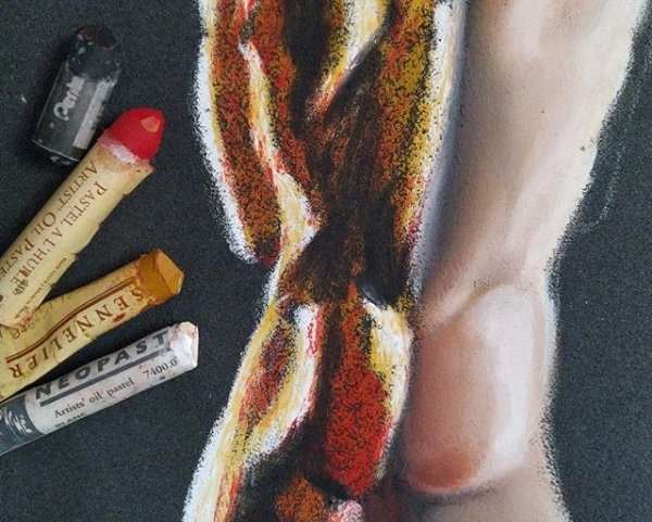
The oil pastels I tend to use are the Sennelier yellow ochre, the Neopastels ruby and white, and either the Van Gogh black or the Pentel black. The Senneliers red and black can be overpowering and difficult to control. The Van Gogh black is a good strong black but easy to control, and the Pentel black is much weaker, making smaller changes to value and hue easier.
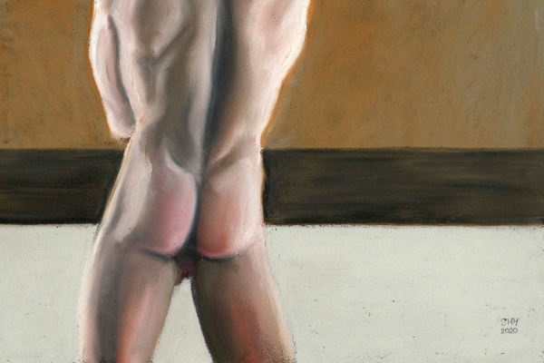
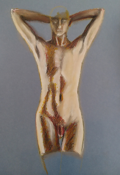
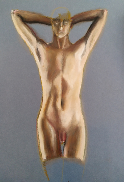
I generally begin a Zorn palette figure by covering the entire area in yellow ochre and then working into that earth yellow couch with the black, red, and white. In the example above, the right hand side has been blended smooth but, before that, it looked just like the left. That painting ended up like this:
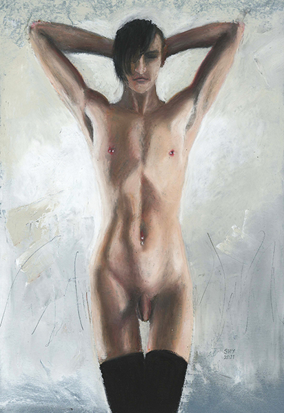
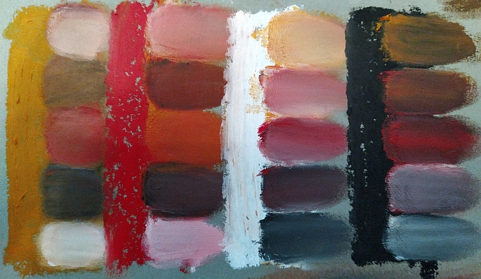
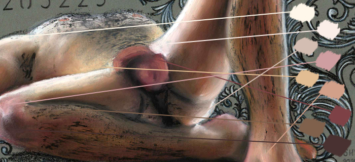
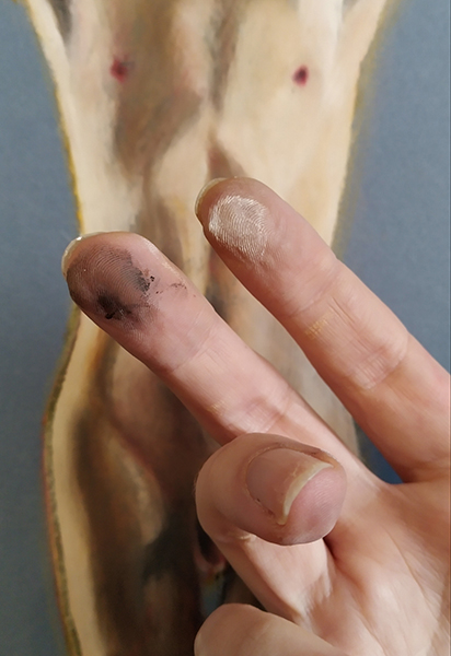
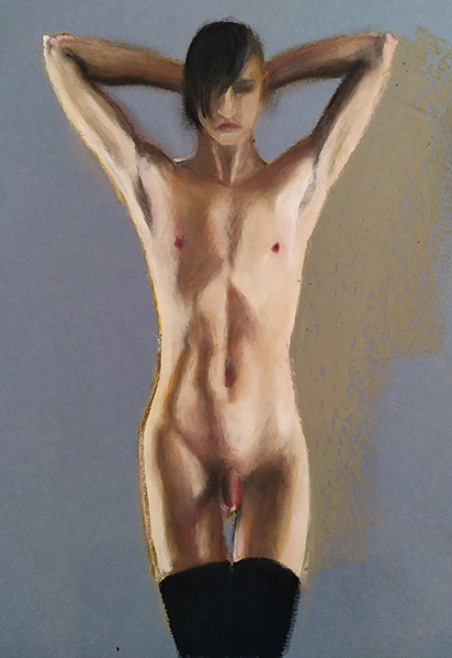
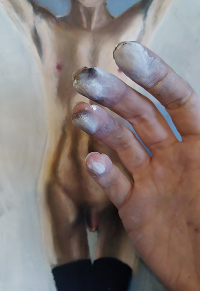
The most common mistake made with the Zorn palette is to mix a single flesh hue and just add black and white for darks and lights. This results in a very flat, monochrome figure. Observe the figure carefully and you can see that there are a hundred variations in colour on a single person. Hands, elbows, genitals, toes, soles of the feet, and the back of the neck tend to be much red or purple in hue than the trunk and limbs, which tend to be yellower. The belly and buttocks tend to be much more pale than the rest of the trunk. Where skin is thinner, such as inside the upper arms, it tends to be pale and ever so slightly green as the colour of the veins affects the appearance of the flesh. In the close up below you can see some of the different hues created purely by blending combinations of just those four different oil pastels.
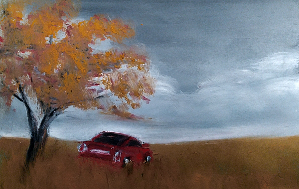
The Zorn palette isn't just for figures, it also makes great moody landscapes. I am not a landscape painter, nor is painting one-inch-square Toyota Celicas a forte of mine in any way, but I did a little six-inch example on a whim, see below. However, there are much, much better example of landscapes painted with the Zorn palette and I strongly suggest looking them up!
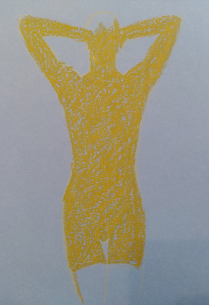
I took some step by step photos of a figure painting in this palette. I used Sennelier yellow ochre, Neopastel scarlet, Neopastel white, and Van Gogh black. The paper is Clairefontaine Paint-On Denim. Because the zorn palette requires a lot of blending, which is effectively mixing colour directly on the paper, you need a decent, heavyweight paper with enough tooth to allow the oil pastels to grip. On inappropriate paper the oil pastel will ball up when you try to push it with your finger, and you'll get patchy areas. It's horrendous, and you don't need to be fighting with your materials while you're trying to make art.
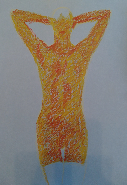
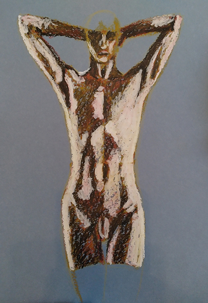
First, start with the earth yellow and colour in the whole shape. Then, add red roughly over the top, paying attention to areas which are more or less red than the average:
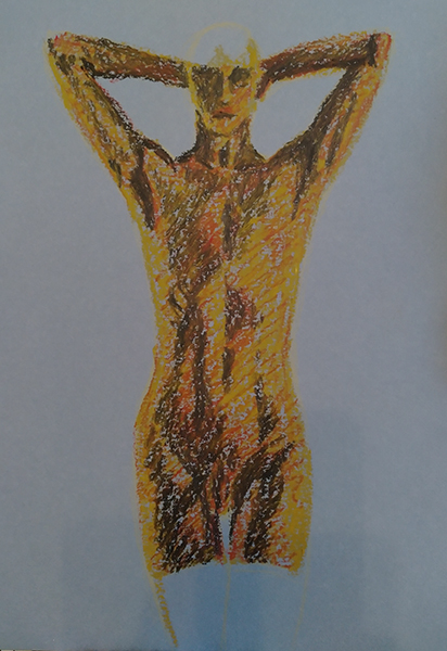
Then add black to the shadowed areas and white to the brighter areas, almost in a black and white notan fashion:
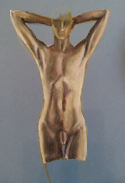
Blend the figure smooth, and then refine areas with all four oil pastels as needed, blending between each stage. Once blended I could see that I hadn't used enough oil pastel in the light areas and they ended looking very patchy, so the first thing I did was to slather a load more oil pastel on the lights. Use one finger for blending light areas and a different finger for blending darks, otherwise you'll end up with greyish mud:
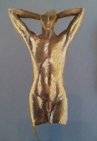
Once you're happy with the bulk of the figure, you can start with details and background. You can see the mess I got into blending the background. Fortunately the tactile nature of oil pastels is the thing about them I love most:
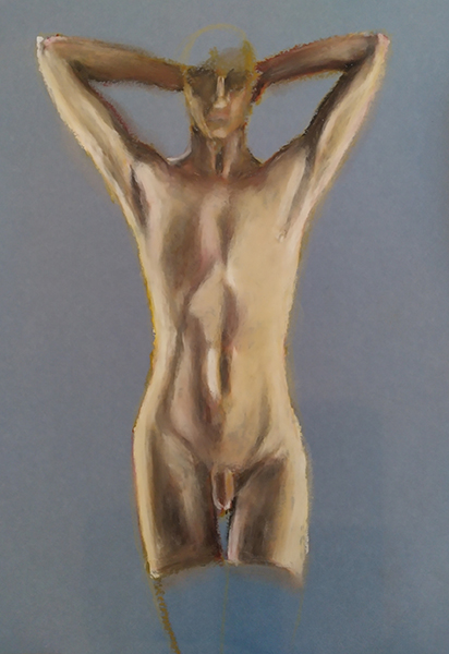
The finished piece: